ROC Curve plot and AUC
In the previous post Predictive Performance Metrics I wrote about a R function that returns a few performance metrics useful to evaluate a binary classifier. And this can be enough in some situations and for some of these metrics.
In the case of the ROC Curve I like to always observe the shape of its plot just to make sure everything is fine, since different shapes of the curve can result the same AUC value. Other plots that I usually observe are the KS, density and percentile plots. But for now, let’s focus in the ROC Curve.
The R function I wrote to evaluate the ROC Curve can be found here. It can handle a single curve or multiples curves in the same plot. This make it easy when you need to compare the results among train, valid and test data or even among different models. To do that, just keep in mind that instead of having different columns for each prediction, you must have a unique column for your prediction, and a column to diferentiate these groups (var.group input).
# Goodness of Fit Metrics 'ROC plot' (for prediction models with target [0;1])

funcGFMplotROC =
function (var.target="", var.prediction="", var.group="", var.df="", var.fsize)
{
    ...
}
So let’s get practical and see how it works!
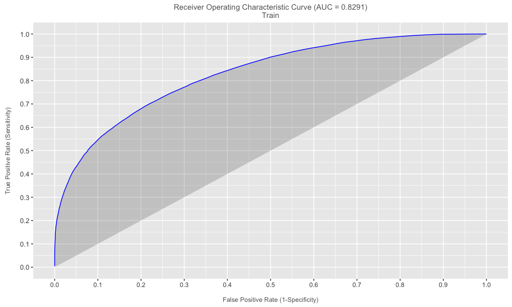
This is an example of a function call. In this case, all the records in the tmp_train data frame is regarding the train subset.
> unique(tmp_train$Scenario)
[1] "Train"
The var.fsize parameter is the reference for the text font size used in ggplot2. Default value is set to 3. Also the var.group parameter is optional and the default value is null.
funcGFMplotROC (var.target="target", var.prediction="pred", var.group="Scenario", var.df="tmp_train", var.fsize=3)
This is the result:
Now consider that the tmp_all data frame contains records for both train and valid.
> tmp_all = rbind(tmp_train, tmp_valid)
> unique(tmp_all$Scenario)
[1] "Train" "Valid"
If you call the same function for this new data frame:
funcGFMplotROC (var.target="target", var.prediction="pred", var.group="Scenario", var.df="tmp_all", var.fsize=3)
The result will be:
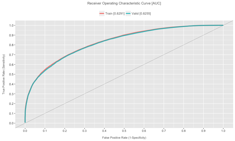
In this case, the plot shows two curves, one for each group identified by Scenario column in the data frame. The values of AUC are shown next to the legend of each group.
You can use now the resulting plot as part of you modeling validation methodology or even to produce pretty markdown reports to document your work and/or to deliver a report to your clients.
That’s all folks! ;-)